Personal Branding
I updated my personal branding based on the original illustration idea from my previous designs. I wanted to update the fonts and colour scheme and decided to base these on my naturalistic inspiration from the Japanese red crowned (Manchurian) crane. This is a beautiful bird from the island of Hokkaido. They are famous for their graceful courtship dance and manage to stand out despite their white feathers in a mostly snow filled landscape with their black extremities and red crown. The contrasting blue colour comes from the ice reflecting the sky which helps to cool down the red in the design. The main font used is Sofia Pro Light and Steelfish for the Stand Out tagline.
You may also like

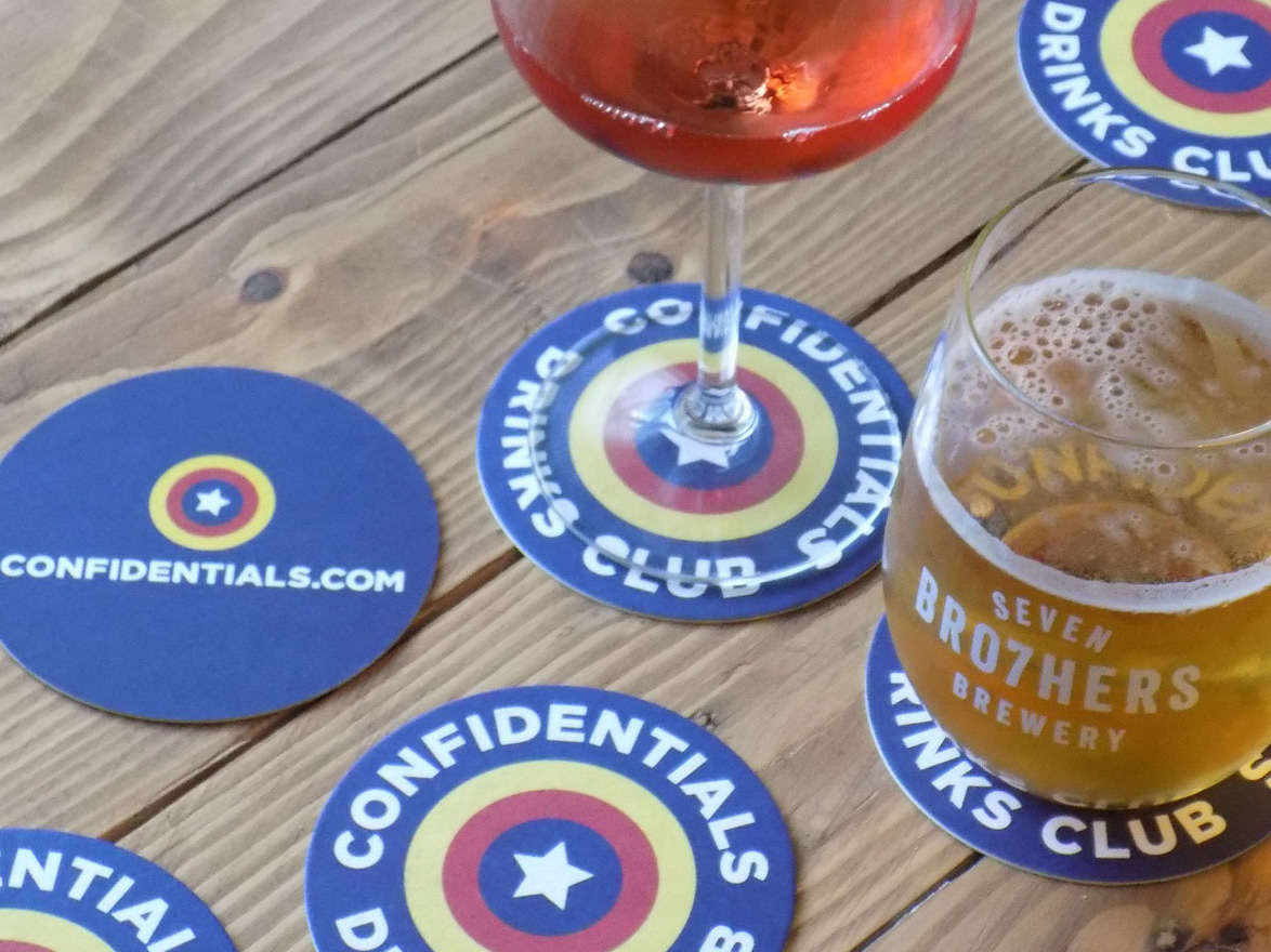
Confidentials Drinks Club
2019

Cube Clothing Website Updates
2025

Direct Fireworks Website Updates
2025

Confidentials Dog of the Month
2018

Auction Against Hunger
2018

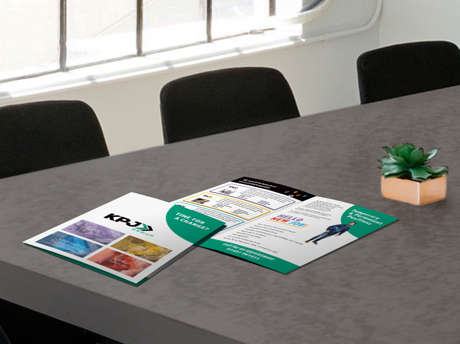
KPJ New Applicant Leaflet
2017

Confidential Guides Hotel Marketing Collateral
2024

Manchester Hospitality Network Social Media Posters
2023

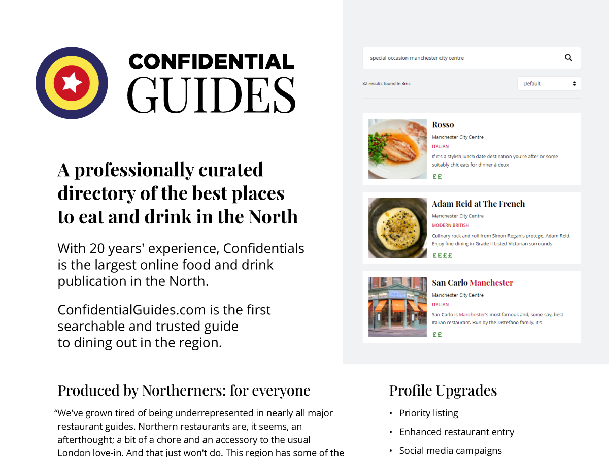
Confidential Guides Features & Benefits Factsheet
2022

Confidential Guides Website Launch
2021